SPEEDSTERS
A conceptual identity inspired by sporting brands that makes the clients feel good and energized
Creative Direction
Brand Strategy & Concept Development
Visual Identity Design
Graphic Design
Typography & Layout Design
Image Creation / AI Image Generation
Art Direction

Speedster is a branding project inspired by companies that adopt innovative approach for better sporting gears.
Speedster is built around movement, discipline, and the confidence that comes from well‑designed athletic gear. The identity focuses on clarity and momentum. Every element is shaped to feel fast, direct, and intentional. The brand speaks to everyday athletes and committed performers, creating a world that feels energetic without being loud.

Visual Identity Direction
The identity is anchored by a streamlined symbol that captures speed in a single gesture. Paired with a bold wordmark and a disciplined grid, the system maintains a strong presence at any scale. The compositions rely on contrast and rhythm, allowing the brand to feel modern, energetic, and grounded. The result is a visual world that is cohesive, confident, and unmistakably athletic.


Typeface
Poppins Bold and Poppins Regular were chosen for their clean forms and strong readability. The typeface supports the brand’s emphasis on clarity and movement. It shapes hierarchy across posters, product tags, and marketing materials. The typography is functional and reinforces the brand’s direct and energetic tone.
Colour
The palette uses red, white, and black to create a clear and assertive mood. Red introduces intensity and drive. White provides space and balance. Black adds structure and stability. Together, these colours form a visual foundation that feels modern, high‑contrast, and built for performance.
Crimson Red
(#097400)
Near White
(#F3FEC2)
Charcoal (#F8F6EA)
.png)

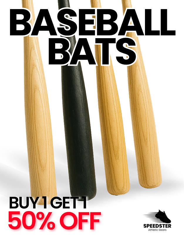
Posters, retail visuals, and promotional materials use bold compositions that balance large type with strong imagery. The layouts are direct and high‑impact, mirroring the energy of the sports world. Each piece feels connected through consistent spacing, colour, and hierarchy. The system is flexible but unmistakably Speedster.