HOOHWAH
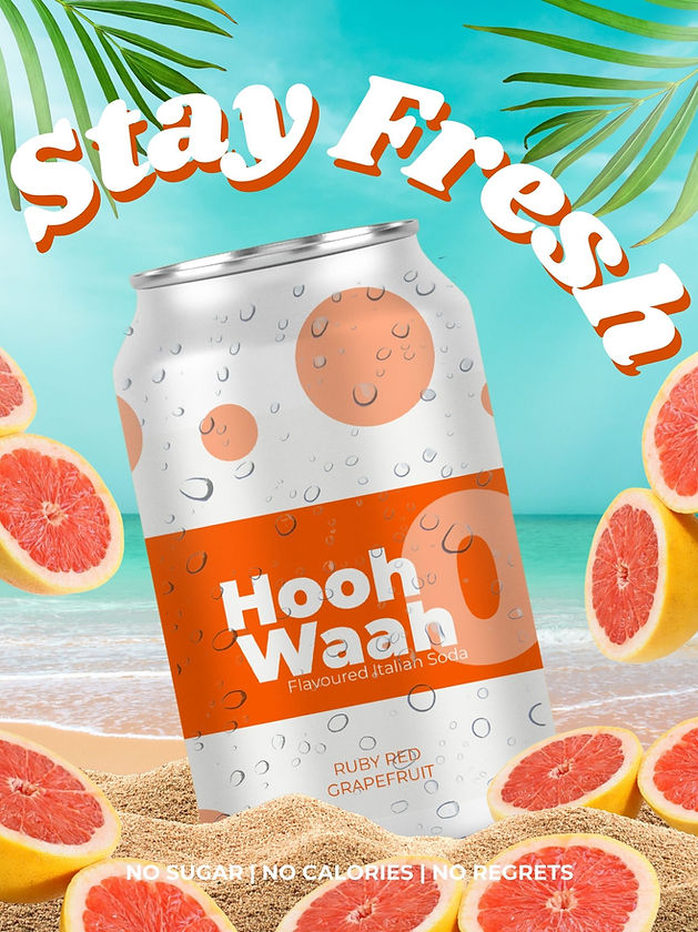
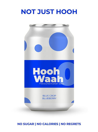
HoohWaah blends crisp bubbles with vibrant fruit notes to create a drink that’s fun, uplifting, and unapologetically bold.
Creative Direction
Brand Strategy & Concept Development
Visual Identity Design
Graphic Design
Typography & Layout Design
Art Direction

HoohWaah is a playful, fruit‑forward Italian soda brand designed to bring joy, colour, and energy into everyday life. Built around bold flavours and even bolder visuals, HoohWaah celebrates the feeling of cracking open a cold can on a warm day — light, fizzy, and instantly refreshing.

Visual Identity Direction
The HoohWaah visual identity is designed to feel bright, expressive, and full of life. Every element — from colour to typography to packaging — works together to create a brand world that’s vibrant, youthful, and unmistakably refreshing.


Typeface
Bold, Playful, and Full of Character
HoohWaah uses a geometric, modern type system that mirrors the brand’s energetic personality.
Primary Typeface — Montserrat Bold Used for flavour names, hero headlines, and expressive typographic compositions.
Secondary Typeface — Montserrat Medium / Regular Used for supporting text, product descriptions, and UI labels.
Typography is intentionally oversized and rhythmic, often interacting with fruit imagery to create dynamic layouts.
Colour
HoohWaah’s palette is built around its eight signature flavours, each represented by a bold, energetic hue. Together, these colours form a vibrant spectrum that defines the brand’s playful, refreshing personality.

Master Brand Colour
These colours define the core HoohWaah identity and appear across brand‑level elements and layouts.
Mandarin Orange
(#097400)
Sunset
(#F3FEC2)
White
(#F8F6EA)
Flavours Primary Colour
Each flavour is represented by a bold primary colour that shapes its visual world and distinguishes it within the full HoohWaah spectrum.
Mandarin Orange
(#097400)
Red Strawberry
(#F3FEC2)
Green Forest (#F8F6EA)
Royal Blue
(#F3FEC2)
Purple Grape
(#097400)
Coconut Green
(#F3FEC2)
Yellow
(#F8F6EA)
Ruby Red (#F3FEC2)

These elements form the foundation of the HoohWaah identity. They define how colour, typography, and layout work together to create a bright, expressive brand world that feels playful, refreshing, and unmistakably unified across every touchpoint.