SANTIAGO'S PIZZA
A conceptual identity inspired by pizza shops that serves fresh and savoury pizzas
Creative Direction
Brand Strategy & Concept Development
Visual Identity Design
Graphic Design
Typography & Layout Design
Image Creation / AI Image Generation
Art Direction

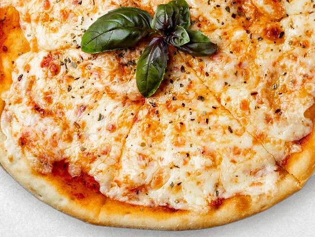
Santiago’s Pizza is a conceptual identity inspired by local pizza shops that focus on fresh ingredients and simple, honest food. The project explores how a modern pizza brand can feel warm, approachable, and grounded through colour, typography, and clean visual structure.
The identity uses soft tones, gentle geometry, and clear hierarchy to create a calm and welcoming atmosphere. Each element supports a visual world shaped by comfort, freshness, and everyday dining. The result is a system that feels contemporary, friendly, and thoughtfully crafted.


Visual Identity Direction
The visual system is built around gentle geometry, warm neutrals, and a grounded palette inspired by natural ingredients. Each element supports a brand world that feels approachable, modern, and connected to the communities it serves.


Typeface
Libre Baskerville and Montserrat Medium were chosen to balance tradition with modern structure. Libre Baskerville brings warmth and heritage that echo the roots of farming communities. Montserrat provides clarity and consistency across applications. Together, the typefaces create a unified voice that feels contemporary and connected to the land.
Colour
The palette uses soft greens, warm neutrals, and deep forest tones. Green reflects growth and renewal. Neutral shades introduce calmness and accessibility. Deeper tones add contrast and stability. Together, the colours create a visual mood that is clean, optimistic, and rooted in nature.
Forest Green
(#097400)
Ivory Tint
(#FFFBEF)
Golden Apricot (#F6B54A)
Brick Red (#BC350A)


The direction focuses on clarity, balance, and a sense of honest craftsmanship. The identity avoids unnecessary decoration and instead uses simple forms, soft colours, and steady rhythm to create a calm and welcoming tone.

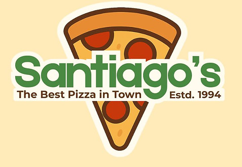
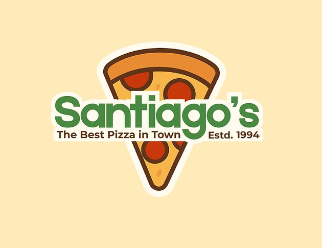
Old Logo
New Logo
Santiago’s Pizza evolves from its original mark into a refined, modern identity that reflects its character more intentionally.

-
Overloaded with toppings and cluttered visuals.
-
Harsh colors of bright green, red, yellow, that strain the eyes.
-
Messy cursive font with poor readability.
Design Breakdown
-
Feels outdated and chaotic
-
Visually noisy; hard to focus
-
Lacks a clear message or brand personality
-
Might feel unprofessional or low-quality
Impression Summary
Design Breakdown
-
Clean, minimal pizza slice with smoother design.
-
Softer, harmonious colors. (Green, orange, golden yellow, brick red, ivory white)
-
Bold, readable font with a clear tagline and “Estd. 1994.”Feels modern, professional, and inviting.
-
Feels modern, professional, and inviting
-
Balanced and visually pleasing
-
Instantly communicates brand identity
-
Builds trust and feels like a quality, well-established pizza brand
Impression Summary


