SANTIAGO'S PIZZA

GRAPHIC DESIGN
& ILLUSTRATION
Santiago's Pizza
We recently had the pleasure of creating a dynamic and eye-catching logo for this popular pizza shop. With its bold, Italian-inspired design, the new logo perfectly captures the essence of Santiago's Pizza and is sure to leave a lasting impression on customers.
We transformed the original logo, from a busy, hard-to-read design, into a clean, modern version that retains the flavor of the brand while improving legibility and visual appeal. The updated look balances playfulness and professionalism, making it ideal for both print and digital use.
Graphic Design

Tools Used
Canva
Adobe Illustrator
AI Image Generation Tools
Skills Applied
Logo Design
Branding
Digital Illustration
Mockups & Presentation
AI-Enhanced Visuals
Layout & Composition
Roles & Responsibilities
Logo Redesign
Transformed an original, cluttered logo into a modern, clean design that enhances brand identity.
Brand Identity Development
Established a cohesive visual style, including color palette and typography, to reflect the brand's personality.
Marketing Collateral Creation
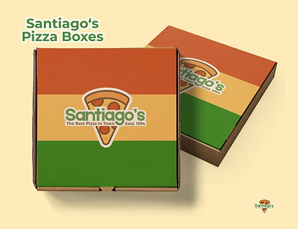
Designed posters, business cards, and packaging mockups to showcase the brand's versatility across various platforms.
Image Curation
Utilized AI-generated and Canva assets to source and edit images that align with the brand's aesthetic.


Santiago's Branding

Favicon


Primary Logos


Logomarks
Forest Green
(#4A8941)
Ivory Tint
(#FFFBEF)
Golden Apricot
(#F6B54A)
Brick Red
(#BC350A)
Peach Cream
(#FEEBB9)


Logo Design Evolution

Old Logo
Old Logo
Design Breakdown
-
Overloaded with toppings and cluttered visuals.
-
Harsh colors of bright green, red, yellow, that strain the eyes.
-
Messy cursive font with poor readability.
New Logo

Design Breakdown
-
Clean, minimal pizza slice with smoother design.
-
Softer, harmonious colors. (Green, orange, golden yellow, brick red, ivory white)
-
Bold, readable font with a clear tagline and “Estd. 1994.”Feels modern, professional, and inviting.
Impression Summary
-
Feels outdated and chaotic
-
Visually noisy; hard to focus
-
Lacks a clear message or brand personality
-
Might feel unprofessional or low-quality
Impression Summary
-
Feels modern, professional, and inviting
-
Balanced and visually pleasing
-
Instantly communicates brand identity
-
Builds trust and feels like a quality, well-established pizza brand

Business Card


In-store Advertising Poster


Branded Packaging


Staff/Operations


